4. Content Components

N
uxtContent Custom Components are vue.js components that reside in SFC .vue file(s) and are used to add custom UI from Markdown content text. For example a custom component can be accessed in Markdown with ::figcaption and convert specified markdown text and links into a <figure></figure> and <figcaption></figcaption> HTML elements.
Resources
Prerequisites
To use the JAMStart Content Components in different projects the following prerequisites are required.
- Nuxt_js project
- NuxtContent module
- Tailwind Typographic Prose module
NuxtContent
The Nuxt Content module for a Nuxt.js project allows you to write beautiful web pages and articles using Markdown. Markdown is a text file syntax that can be quickly converted into HTML with headers, text, images, etc. A Markdown text file is small, readable on its own, and quick to write in any text editor. The NuxtContent module reads the Markdown files and converts them to HTML.
Tailwind CSS Typographic Prose
The Tailwind CSS Typographic Prose module automatically styles common HTML elements for readability on the web. By adding the prose class to the parent element all the children elements inherit the base readability. See this Tailwind Typographic implementation for installation of the module and issues I've encountered with it.
Content Components
Content Component Directory
The JAMStart content component files can be found at ./app/components/content, and adding a new content component is as simple as placing the component .vue file there.
Markdown Usage
The Markdown syntax for specifying which content will belong to the custom component is to use start tag ::[name] and an end :: tags. Everything in between the tags is the default slot of the component. The [name] being the name of the custom component.
Name Casing
To invoke the custom component from your Markdown content, you can use snake-case, PascalCase or camelCase for multi-worded components, i.e. a custom component FigureCaption.vue could be invoked as ::figure-caption, ::FigureCaption, ::figureCaption, or ::figurecaption (case is not meaningful). The ::figure-caption style is recommended as it might be more easy to type for content writers.
Slots
Content components can have a single default slot or a default slot and multiple additional slots. Each Custom Component is different, and read the component documentation to see what slots it supports. As an example a FigureCaption component, might use the default slot for the figure and a named slot for the caption.
Slot Markdown Syntax
Within the NuxtContent Custom Component block, the text up to the next slot or the end of the block is the default slot. Named slots are specified with #[SlotName] on a single line and everything after that until the next named component or end of the block is for that slot. For example, a FigureCaption might specify the figure in the default slot, the main caption in the #caption named slot, and the sub caption in #subcaption named slot.
For example, this shows FigureCaption custom component using default and #caption slots.
::FigureCaption

#caption
This is the caption for the caption named slot
#subcaption
This is the sub caption for the subcaption named slot
::
Passing Props
To pass properties to a NuxtContent components there are two different methods:
- Inline Method
- YAML Method
Inline Method
The inline method uses {} after the component name (no space) with different key=value pairs separated by a space.
::alert{type="warning" icon="exclamation-circle"}
Oops! An error occurred
::
YAML Method
The YAML method uses --- {props} --- in the space below the component name, one per key in YAML syntax, i.e. key: value
In this example, you are passing icon, description, and title props to the `IconCard' custom component.
::icon-card
---
icon: IconNuxt
description: Harness the full power of Nuxt and the Nuxt ecosystem.
title: Nuxt Architecture.
---
::
FigureCaption Component
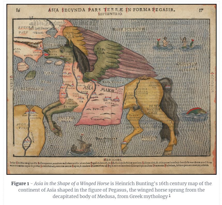
Figure 1 - Asia in the Shape of a Winged Horse is Heinrich Bunting's 16th century map of the continent of Asia shaped in the figure of Pegasus, the winged horse sprung from the decapitated body of Medusa, from Greek mythology
How to Use FigureCaption
FigureCaption is a custom Nuxt Content Component that adds an image with a caption to any Markdown page. To add this, include the following bare bones text into a Markdown content page.
::figure-caption

#caption

::
Insert a picture in the form of [picture alt text](\url\to\image) between ::figure-caption and #caption
Write the caption text between #caption and ::
For example, to get the same Figure Capture as is displayed at the top of this page, write the following text into a Markdown content page.
## FigureCaption Component
::FigureCaption

#caption
**Figure 1** - _Asia in the Shape of a Winged Horse_ is Heinrich Bunting's 16th century map of the continent of Asia shaped in the figure of Pegasus, the winged horse sprung from the decapitated body of Medusa, from Greek mythology
::
Code
The Figure with Caption content component at \app\components\content\FigureCaption.vue renders an image as a full block with an optional caption of text below. It shows:
- Block Component
- Slots
- Default Slot
<slot /> - Named Slots
<slot name="caption" /> - Conditional Slot
v-if="$slots.caption" - Combinator Selector in Scoped Style
:deep(img)
MonkInset Component
M
onkInset is a JAMStart developed NuxtContent custom component that cordons specific character or image content (actually any text or images) in a markdown file and places it in a separate sized <div></div> element and floats it right or left. The intent is that one can create an effect similar to large embellished initial characters of an illuminated medieval manuscript and the other text 'flows' around it. See examples
MonkInset Slots
MonkInset only has a default slot.
MonkInset Parameters
The two main key parameters for MonkInset float and size
float:- float to right or leftleft(default)right
size:- pick a sizexssmmd(default)lgxl
Additionally, some CSS parameters can be overridden
margin- This is the margin on the side of the MonkInset<div></div>element separating it from the content on the other side. Iffloat="left"it ismargin-right:, if"float=right", it ismargin-left.maxHeight- This themax-height:of any<img><img>element within MonkInsetmaxWidth- This themax-widthof any<img><img>element within MonkInsetfontSize- This is thefontsize:of any<p></p>element within MonkInsetheight- This is theheight:of any<p></p>element within MonkInsetlineHeight- This is theline-height:of any<p></p>element within MonkInset
Text Examples
xs
Xs
X
Cillum esse pariatur et culpa amet. Commodo non do dolor exercitation. Ad cupidatat commodo quis quis consequat.
sm
S
Sm
Cillum esse pariatur et culpa amet. Commodo non do dolor exercitation. Ad cupidatat commodo quis quis consequat.
md
Md
M
Cillum esse pariatur et culpa amet. Commodo non do dolor exercitation. Ad cupidatat commodo quis quis consequat.
lg
L
Lg
Cillum esse pariatur et culpa amet. Commodo non do dolor exercitation. Ad cupidatat commodo quis quis consequat. Cillum esse pariatur et culpa amet. Commodo non do dolor exercitation. Ad cupidatat commodo quis quis consequat.
xl
Xl
l
Cillum esse pariatur et culpa amet. Commodo non do dolor exercitation. Ad cupidatat commodo quis quis consequat. Cillum esse pariatur et culpa amet. Commodo non do dolor exercitation. Ad cupidatat commodo quis quis consequat.
Emoji Examples
xs
💣
⛄
Cillum esse pariatur et culpa amet. Commodo non do dolor exercitation. Ad cupidatat commodo quis quis consequat.
sm
⛄
💣
Cillum esse pariatur et culpa amet. Commodo non do dolor exercitation. Ad cupidatat commodo quis quis consequat.
md
💣
⛄
Cillum esse pariatur et culpa amet. Commodo non do dolor exercitation. Ad cupidatat commodo quis quis consequat.
lg
⛄
💣
Cillum esse pariatur et culpa amet. Commodo non do dolor exercitation. Ad cupidatat commodo quis quis consequat. Cillum esse pariatur et culpa amet. Commodo non do dolor exercitation. Ad cupidatat commodo quis quis consequat.
xl
💣
⛄
Cillum esse pariatur et culpa amet. Commodo non do dolor exercitation. Ad cupidatat commodo quis quis consequat. Cillum esse pariatur et culpa amet. Commodo non do dolor exercitation. Ad cupidatat commodo quis quis consequat.
Image Examples
xs

Cillum esse pariatur et culpa amet. Commodo non do dolor exercitation. Ad cupidatat commodo quis quis consequat. Cillum esse pariatur et culpa amet. Commodo non do dolor exercitation. Ad cupidatat commodo quis quis consequat.
sm
Cillum esse pariatur et culpa amet. Commodo non do dolor exercitation. Ad cupidatat commodo quis quis consequat. Cillum esse pariatur et culpa amet. Commodo non do dolor exercitation. Ad cupidatat commodo quis quis consequat.
md
Cillum esse pariatur et culpa amet. Commodo non do dolor exercitation. Ad cupidatat commodo quis quis consequat. Cillum esse pariatur et culpa amet. Commodo non do dolor exercitation. Ad cupidatat commodo quis quis consequat.
lg
Cillum esse pariatur et culpa amet. Commodo non do dolor exercitation. Ad cupidatat commodo quis quis consequat. Cillum esse pariatur et culpa amet. Commodo non do dolor exercitation. Ad cupidatat commodo quis quis consequat. Cillum esse pariatur et culpa amet. Commodo non do dolor exercitation. Ad cupidatat commodo quis quis consequat.
xl
Cillum esse pariatur et culpa amet. Commodo non do dolor exercitation. Ad cupidatat commodo quis quis consequat. Cillum esse pariatur et culpa amet. Commodo non do dolor exercitation. Ad cupidatat commodo quis quis consequat. Cillum esse pariatur et culpa amet. Commodo non do dolor exercitation. Ad cupidatat commodo quis quis consequat.